Monday, September 27, 2010

more colour testing . . . This is so fast & FUN!

I've been loking for a way to speed up my Home Portraits and this may help tremendously.  At the very least it gets me to the first proof print in a number of hours rather than days.  It allows me to create a colour palette specific to the image to then use for the detail work without straying far from the proof print! 

Here is the Home Portrait proof test I worked out yesterday in about 3 hours.  I saved the Mixer Palettes which were different for each version.  I'll do screen grabs of the next one I post.  Meanwhile here are the 3 versions of this charming cottage with the subtle colour differences that don't really LOOK that different but the "dropper #'s"  are quite different!

Sunday, September 26, 2010

colour in a painting . . .

. . . is different than thinking or "recognizing" colours.  That last Home Portrait was so unsatisfying because of the colours.  The building was red brick.  The vegetation was green. The sky was blue.  BUT . . . why was that nowhere near the experiance of the scene?


I guess it struck me as I was watching a show on Modigliani - why did he get a likeness when his "formula" was so graphic?  Why did he remove so much detail? Even the pupils of the eyes were gone after a while.   I drifted off pondering these things, musing on that horrid home painting - musing why it was so flat and primitive and really, to me, boring.  If I manage to market this product - I'll get lots of red brick, summer portraits in this area so I better find some way of making them beautiful.  

I desaturated the painting - it was distorted.  The greys were very uneven, ungrounded.  I wondered if that was a result of the colour palette.  Every colour was represented - almost evenly and veery highly saturated too.  In attempting to define each element in the painting I was isolating each one.  The "lost line" is hard to define with opposing colours.  I really need to find a way to leave the colour till the end of the process.  So if I decide to start the image in basically a monochrome . . . not greyscale NO MOOD - that was abhorant to me.  I decided I should focus on an initial wash of the canvas, then blendup to a colour that represents the element.  


EXPERIMENT #1
So here is the test pic.  Is this image blue? green?  or yellow?  It is not red although I might play with that to learn more.


I think they are all very different. 

Friday, September 24, 2010

I've suspended work on the red brick Home Portrait.  The prospect is a Landscape architect!  He will OBVIOUSLY change the yard. What's the purpose of wrestling with a red&green painting (my least fav colours)? So Back to the drawing board (pun?)

Here's Charlotte:

And Jeff:


Sunday, September 19, 2010

Home Portrait - CtyRd 23

How to begin?
Here is one of the many reference photos - I guess the one that most captures the experiance of the property.
So, given the restraints of cost: printing myself to canvas, framing with a generic "fine art" 11"x14" frame, I am bound to compost for that final 'product'. Tricky to create as the property is large with many foundation plants but no flowers to brighten up the painting. By comparison, the house is small - the gingerbread mouldings and old brick are what gives the charm.  Sooooo . . .


This is the basic layout. I added peonies (carefree in this climate) to the front border as well as opening up an inviting pathway. I framed the composition with suggestions of landscaping from the rest of the yard while making the house large enough to  paint the details of moulding and brickwork.  I wanted to retain the dynamic diagonal of the road edge and added chicory - little pieces of sky that are ubiquitous because it increases the drama of this otherwise humble abode.

I could keep refining this stage for weeks but my deadline is framed in 6 days from now and working 3 jobs renders that a luxury not possible now.

Wednesday, September 8, 2010

I met a friendly volunteer this morning while waiting for an estimate on a repair to the clock and turn signals in my car.
Thank you Peter!

Tuesday, September 7, 2010

QP reversed Painting the highlights with a dark BG

is slower.  I am also having trouble making the aquaintance of fresh subjects.  After rather icy treatment by the "cocktail waitress" at Miss Lilly's Cafe, I am now back at the friendly Bean Counter Cafe.

So, here is the QP-du jour - moi as usual these days and again pushing the funvelope.  Dark BG's definately take longer and this one too 1.5 hours.  By setting the colour-space settings in Painter to AdobeRGB instead of my Huey calibration, I get a more acurate paint colour.  It is still a bit washed out though.
I am still concerned with maintaining likeness - miles to go on that road . . . .

Thursday, September 2, 2010

Self QP - wish the colour would stay the same from the painting in Painter . . .


And yes more discontent from this blog template - unable to add a table to enable text to the right of the image without editing the HTML.


Us little monkeys will always create negative & positive out of every situation. . . .

Peggy DeWit - successful photographer here in the County (on top of taking Wonderful photos) - came over to me here in the Bean Counter Cafe - introduced me as a "fantastic artist who paints on the computer" (blush, thank you Peggy) to a woman with a small grant to study & aid small business in this area.  "Enterprise Facilitation Project" - something I would like to know more about.

Monday, August 23, 2010

2010 August 23 - @ Picton


Here is my lastest QP.  I am using a different process to get a more "painterly" result.  I  like it so much I want to do another one but have no immediate 'guinea pigs'. 

Tuesday, August 17, 2010

Tuesday the 17th


So I'm getting a doctor finally after being here a year and I thought it might be a good idea to give a sheet with my "issues" on it so I've made a sheet that I can put text on.  I didn't want it to be really specific as in a life drawing but also wanted to "personalize" it in such a way that it would leave no doubt whose chart it belonged to.


So here it is - and I can print off fresh copies with updated heads etc. Cool eh?  I can write on it manually or type for clarity in Photoshop.

    Yesterday Afternoon I went to the Outlet Beach at the Sandbanks Prov. Park in PEC, Ontario.  There was a strong wind blowing and the breakers had about a 3 foot swell.  When I got out to over my waist, I was lifted off my feet and carried back toward the shore - so then, of course one walks out asap.  It is best to walk backwards. I somehow remembered that from my childhood.  A rejuvenating experiance! 
I took some photos & may use some in a painting . . . in my spare time.  Today, back to work on the stone house.

Monday, August 16, 2010

Saturday, August 14, 2010

Saturday the 14th - @ STBX

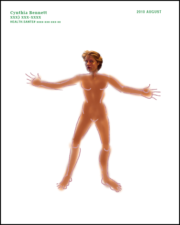
Still took me an hour but was really fun - If anyone knows how to align this text to the top of the image with
's, let me know please.  I can only think of putting both in a table with 2 columns and that might not work well in all browsers now. . . .
   I'm having a great day so far - my last Saturday without working the whole day :( for a while at least ):
  1. I woke up when a dear friend who shall remain nameless texted me at 2:45am my time.  I've been on edge for some reason although I've been trying to relax and I thought it was an alarm to get me off to Picton. Anyway, after debating with myself as to how to respond to the fact that I was FULLY awake after having only 3 hours sleep, I concluded that I was hungry (no dinner last night) and so I should go to the 10 Acre 24 hour Truck Stop where the WIFI is "Our 10 Acre Guests" - you don't even have to login! and have their yummy $6.75 Breakfast Special.
  2. So I got there about 20 minutes later. I decided to work on a doggy portrait that I'd really like to use in my next display at The Pampered Pooch.
  3. Then I drove to Picton, cleaned the locker rooms and having some energy left, deposited my pay at the bank and went to STBX where I made my new self portrait and am now posting this blog.
Not bad for running on 3 hours sleep!

But why is the colour so wierd?  Should I convert to sRGB?

Wednesday, August 11, 2010

Wednesday the 11th - 398 Main St. Picton

My Concern is to grab viewer and dignify this house.  It is a little unkempt and the grounds slightly over-grown. Perhaps this could be depicting an earlier time.  There is a large front yard with mature trees.  The lot backs to the steep hill down to the harbour.  
Here is the MLS photo. It really is the only angle to take the shot and the lampost poses a problem for photographs but not for painters. Looking at the 2 images, I notice there are some errors in my painting.  The lampost on the right needs defining - I'll place it a little further away from the side door.  The seller installed flower baskets on the front lamppost.  I wasn't sure what they were in the small photo I was using and there is a dark blob from the silhouette - I'll add the stone wall back.  I also painted out the window on the sunny side of the vestibule.  Another dominant feature of this house  when you are actually there looking at it are pie shaped red and blue glass pieces in the widow's walk windows - they are too pale in my painting and certainly don't photograph well.  There is also an urn on a plinth by the front path . . . don't know if I'll put it in.  I should paint in the flower bed though.

However, it is now past 4am and I think I can sleep now.  With luck, I can continue tomorrow.

Sunday, August 8, 2010

Sunday the 8th - @ STBX

It is a rainy day & wil get hotter as the week progresses.  A good time to work on existing paintings at my basement studio.
I am so happy that I can post images from my Mac while "on the road" !
This has made my day!